STARK CONTRAST

LUISAVIAROMA HOME CAMPAIGN 2016
CREATED BY VALENTINA GUIDI OTTOBRI
Ph. Ruggero Lupo Mengoni
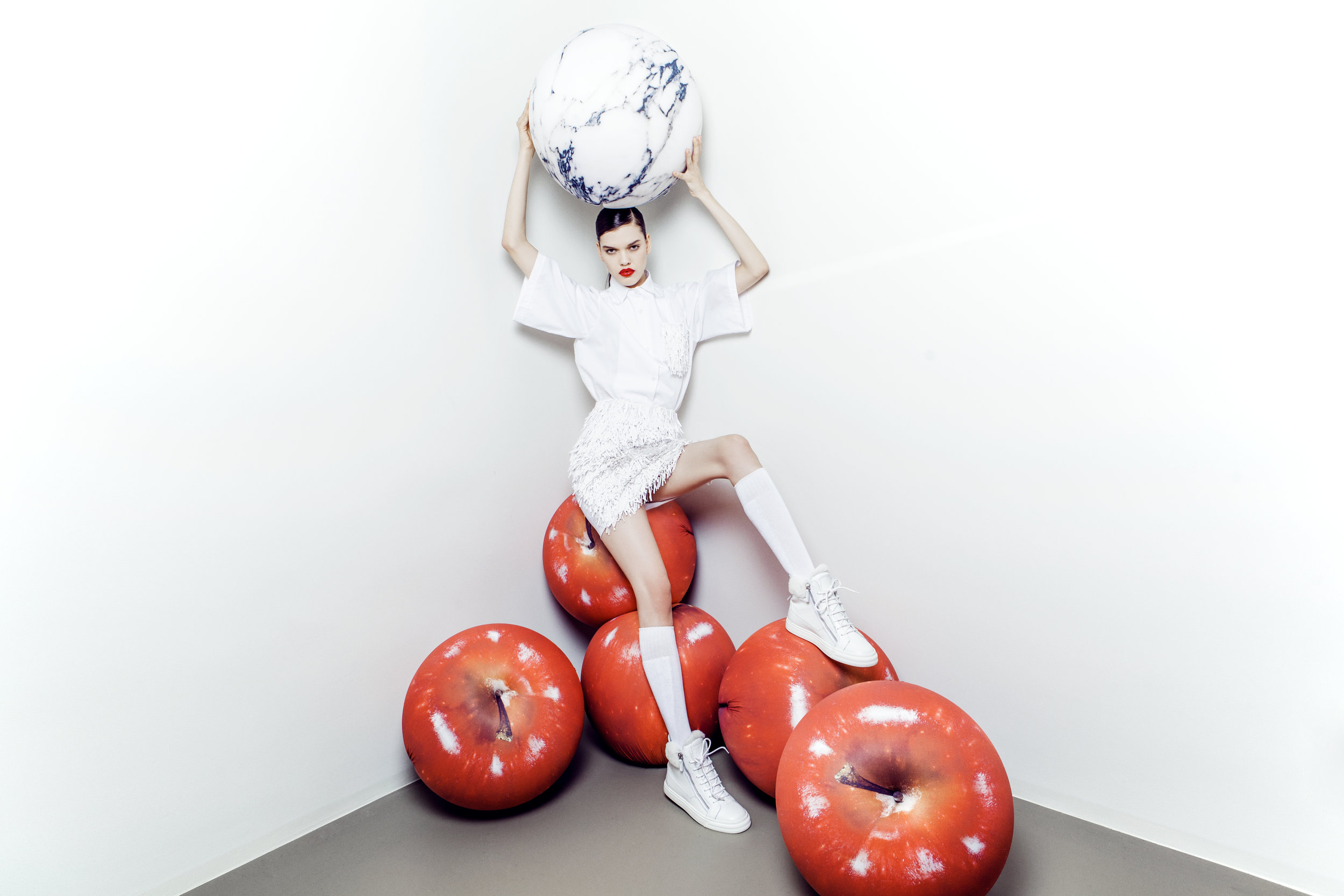
Stark Contrast explores the expressive potential of contemporary design through a rigorous interplay of red and white, where color becomes both material and narrative device. The visual language is defined by bold geometry, precision of form, and the tension created between opposing tones. The campaign frames objects and spaces as protagonists, where minimalism meets theatricality. White surfaces amplify light and shadow, while vibrant red punctuates, disrupts, and commands attention. The result is a visual rhythm in which design elements oscillate between restraint and exuberance, simplicity and drama. This project celebrates the dialogue between function and perception, inviting viewers to engage with form as both utility and visual statement. Every composition becomes a study in balance, proportion, and contrast — a meditation on how color and materiality can shape experience, evoke emotion, and transform contemporary interiors into immersive visual narratives. Stark Contrast positions contemporary design as both art and language, a platform where the economy of form meets the intensity of color to produce a compelling, memorable aesthetic.